Spartex



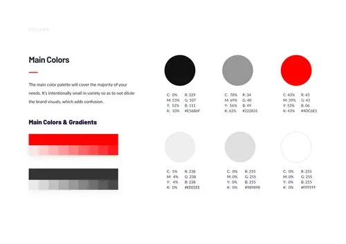

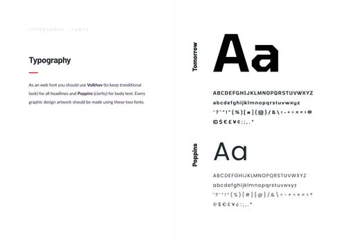



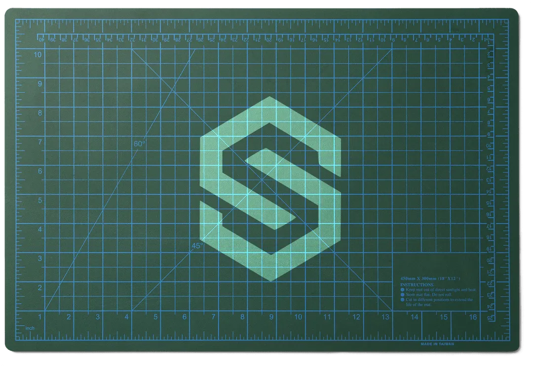


The logo for Spartex has been designed to reflect the values and character of the company. It is modern, dynamic, and harmonious, utilizing carefully chosen colors and shapes that symbolize energy, innovation, and professionalism. The logo showcases a unique combination of graphics and typography, creating a recognizable visual identity for the Spartex brand.Spartex's branding is created based on the company's philosophy and mission. The branding elements, such as color palette, fonts, patterns, and graphics, consistently represent the image of the Spartex brand. The branding reflects the company's values, including innovation, quality, and professionalism, building trust among customers and setting Spartex apart in the market. The overall branding project is cohesive and effectively communicates the company's identity and message.The web development for Spartex's website in Webflow follows modern design standards and technologies. The website is optimized for users, providing intuitive navigation and visually appealing experiences. By utilizing the latest programming tools and techniques, the website is responsive and adapts seamlessly to different devices, ensuring excellent user experience on every screen. Integrated analytics tools allow for tracking and analyzing website traffic, enabling optimization and customization of the marketing strategy.The entire project, including logo design, branding, and web development, has been carefully executed to provide Spartex with a distinctive image and a professional online presence.
